ASPCA Adoption Flow Redesign
Role: UX designer, UI designer
Team: Andre Coleman, Megan Ferry, Jose Osorio, Regency Smith
Year: 2023 (2 week project)


Challenge
We have observed that the current site lacks transparency and a balance of uplifting images & success stories, which may cause users to prematurely leave the site out of frustration and distress.
Proposed Solution
Creating a clean, inviting interface for the website that provides detailed information about the animals they house, as well as easy to follow next steps through the adoption process.
Research
First Impressions
Dead end links
Depressing imagery
Donate, donate, DONATE!
Unreliable pet information
Messy navigation
Pet profile display is not constant across the website
User Survey
Interview Plan
Goals
To discern how users search for animals to adopt.
To name emotions users have when searching through pet adoption websites.
Discover what aspects of a website help a user to complete their pet adoptions.
Determine pain points on the pet adoption websites.
Questions
Do users search through specific apps/websites to find pet adoptions?
Does appealing to or manipulating user emotions help/hinder during the adoption process?
What features on a website's UI assist users in completing a successful pet adoption?
What, if any, difficulties are present when adopting a pet? What aspects are delightful?
User Testing Insights
Hypothesis
Potential pet owners need clarity regarding the adoption and information processes on the ASPCA website. A lack of transparency and/or crudely-presented information regarding animals creates distrust, which leads to users leaving the website and not adopting.
Ideation
Competitor Analysis
User Flow
Priority Matrix
We determined the highest priorities for users and the ASPCA’s adoption process were:
Users being able to track their progress throughout the adoption process
Keeping the experience from feeling depressing or overtly manipulative throughout the website and adoption user flow
User Journey
We created a user journey to reveal key priorities and opportunities for our persona.
Scenario
Jasmine is a owner of two cats. She recently had to put her dog down for medical reasons. She finally feels comfortable looking for a new pup.
Expectations
Able to find a dog that matches her lifestyle
Has clear communication with the society
The adoption process is intuitive and enjoyable
Wireframing & Prototyping
This is the initial wireframe for the flow of adopting a dog.
(Full Figma files can be provided upon request)
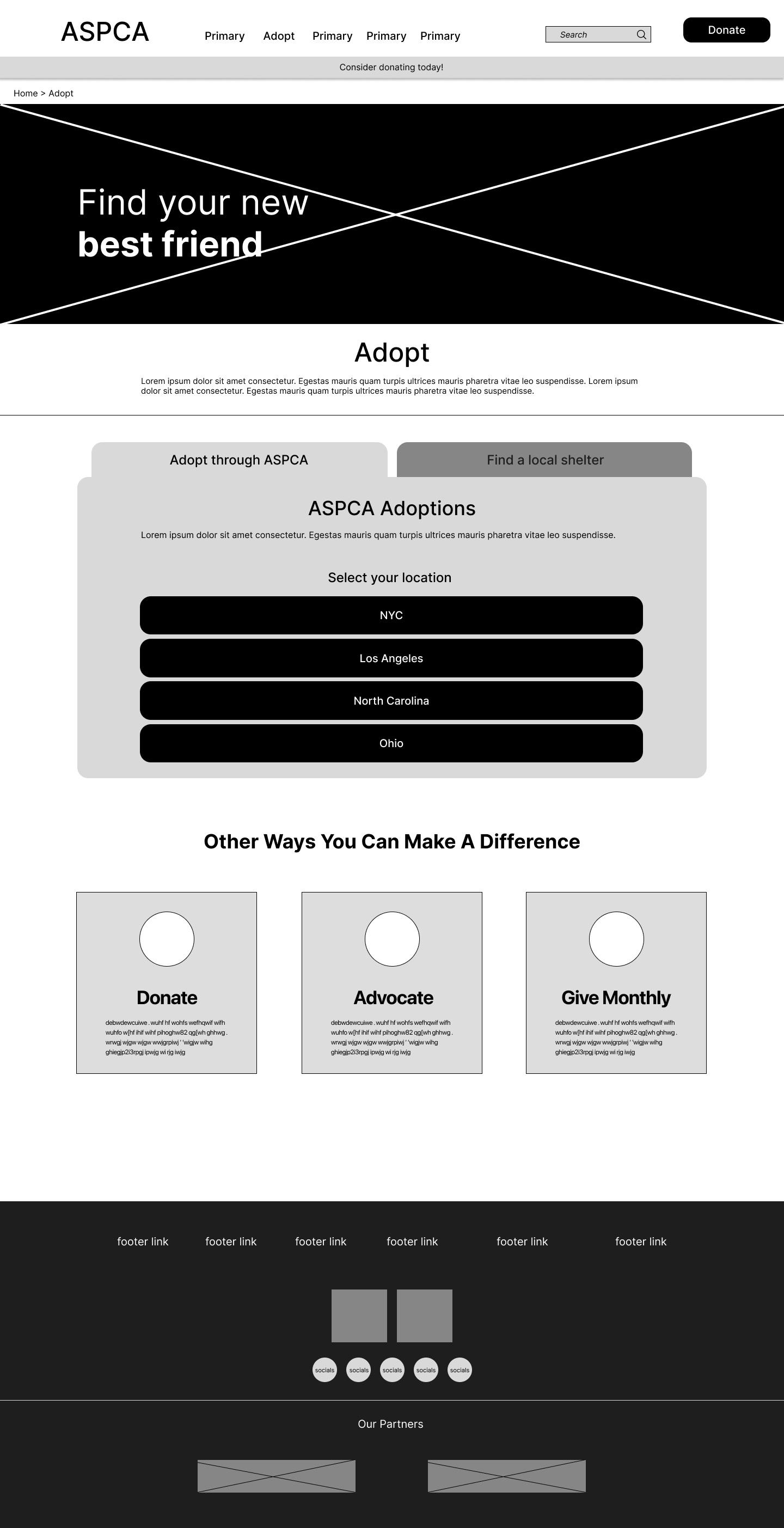
Home

Adopt

List of dogs

Dog profile

Adoption step 1

Adoption step 2
Adoption step 3

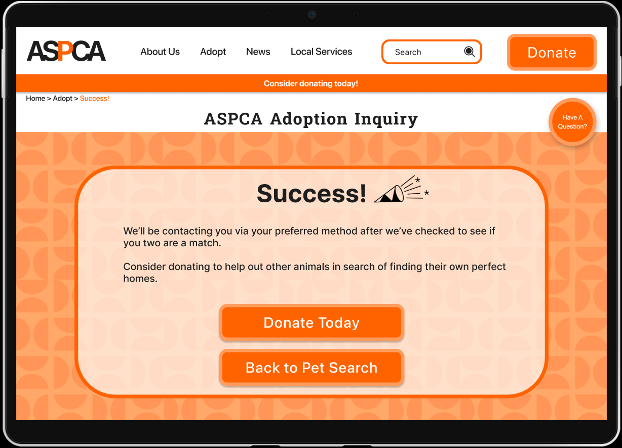
Success
Style Guide
Based on initial user testing, this tab design simplified adoption navigation. I applied the style guide to achieve a more uplifting appearance.
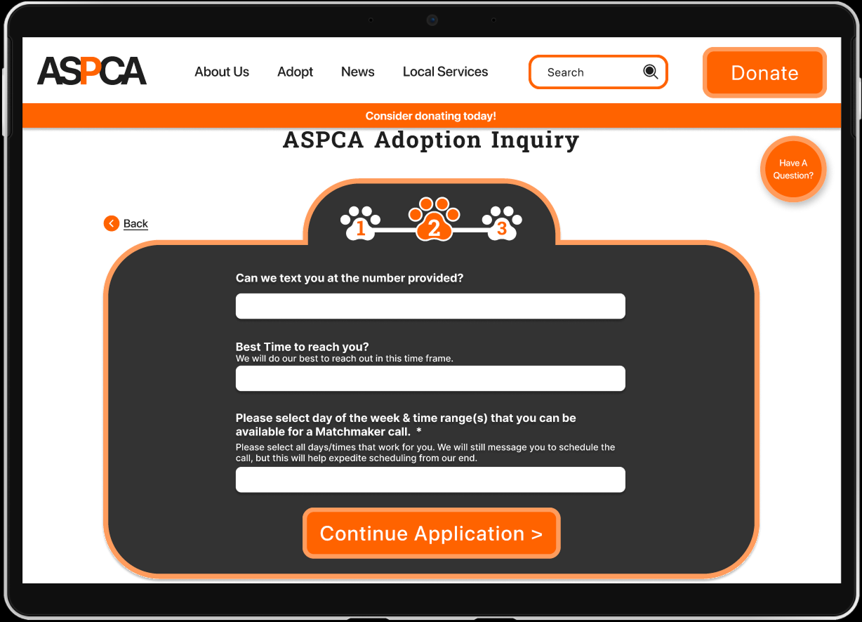
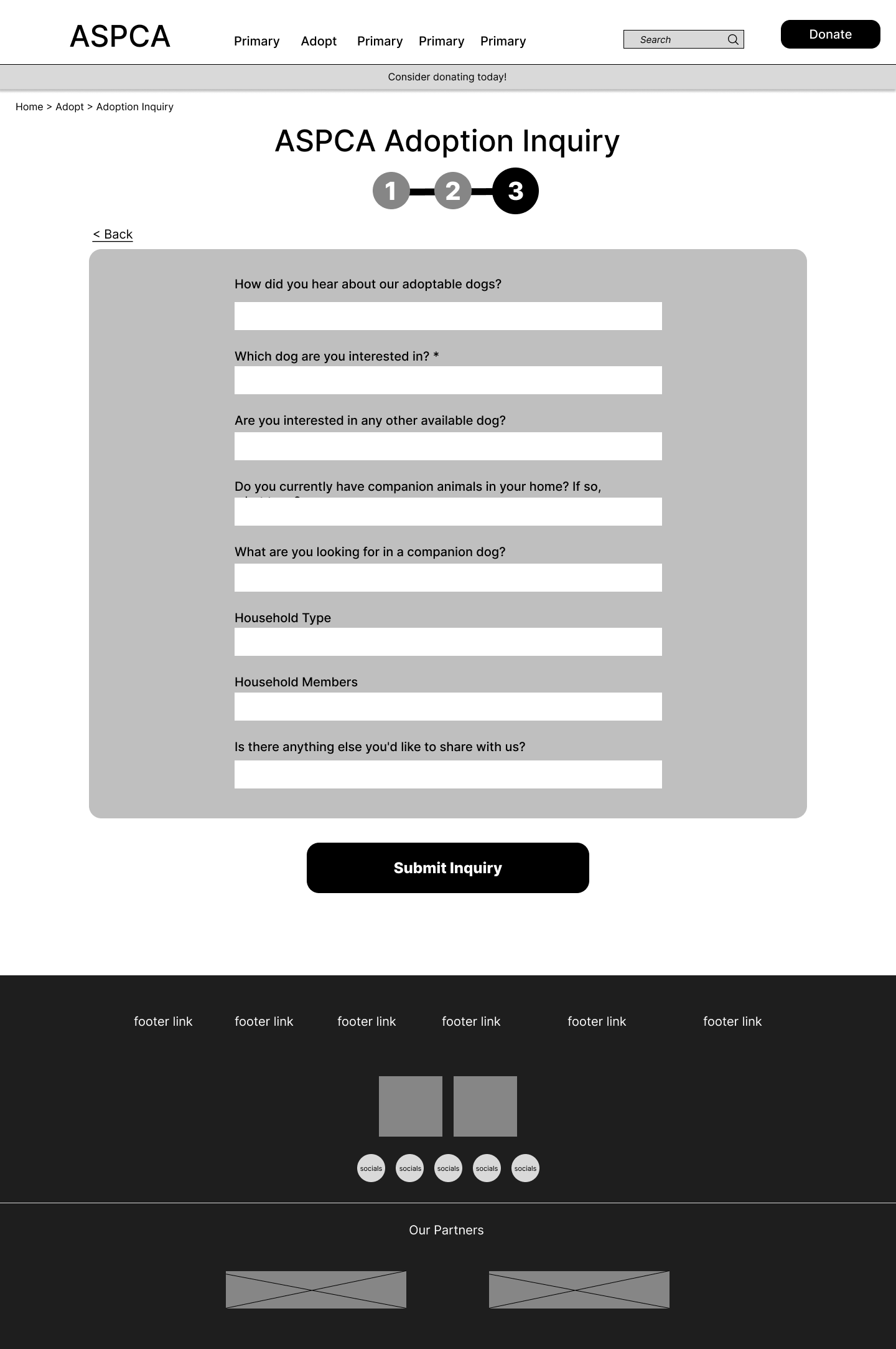
Progress Tracker
The initial adoption inquiry form was one long page of fields to fill out. Users disliked how much information there was to absorb on one page. I refined the wireframe form into digestible chunks, and added a progress tracker so users knew where they were in the adoption process. In further testing, users found this to be a good solution.
original adoption form → wireframe tracker → styled prototype trackerHigh Fidelity Prototype
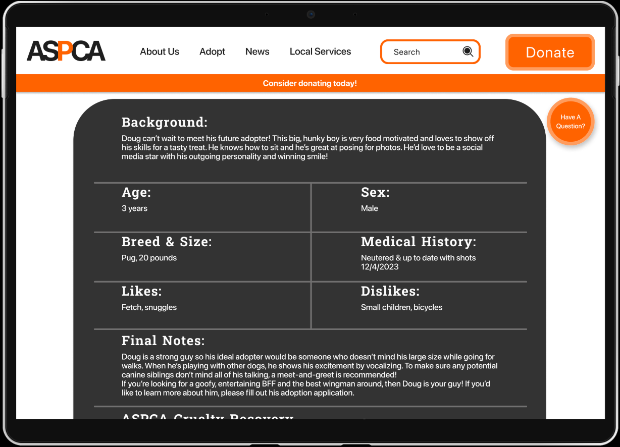
After building our Hi-Fidelity prototypes, we performed usability tests and iterated the final version based on feedback.
(Full Figma files can be provided upon request)
Final Thoughts
I learned a lot about the impact of an established brand’s tone and how it informs users’ decisions and experiences.
Next Steps
Developing an ASPCA adoption mobile app, right now they do not have one
Donations are a huge importance to the ASPCA so fleshing out the donation screens with our established style guide would be an important next step