Got A Ukulele Website Redesign
Role: Researcher, Interviewer, UX designer, UI designer
Team: Andre Coleman, Megan Ferry
Year: 2024 (2 week project)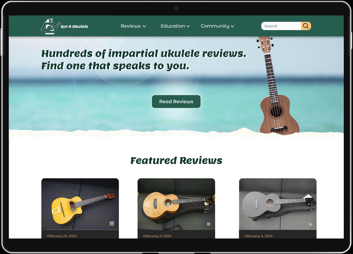


Challenge
Gotaukulele.com is the #1 most shared resource of quality reviews for people looking to purchase a ukulele and access ukulele resources. We have observed the review content is not able to be filtered, making it difficult for users to accomplish finding an instrument within their search criteria.
Proposed Solution
Our solution is to organize the information into easy to navigate categories, which allows users to intuitively locate specifically filtered reviews and resources.
Research
First Impressions
17 individual navigation links
Confusing hierarchy of content
No way to filter multiple search constraints
User Survey
Interview Plan
Goals
To discern how users search for useful information about ukuleles
To determine what kind of user is browsing reviews
To determine what links gotaukulele.com users are searching for in the navigation
To determine how ukulele players categorize the different instruments
Questions
Why do users visit gotaukulele.com?
How do users search for specific reviews on the website?
What categories of ukuleles are users searching for?
What frustrations do users have trying to find the right instrument for themselves?
User Testing Insights
Hypothesis
Redesigning the User Interface of gotaukulele.com will help newcomers and enthusiasts better access useful information, because it will be easier for them to navigate, search, and filter for reviews that apply to their interests.
Ideation
Indirect Competitor Analysis
Using inspiration from successful specialty review sites (mattresses, cameras, electric bikes, etc.) informed the flow I created to allow the user to filter criteria based on what users considered important when purchasing an instrument online.
User Flow
Priority Matrix
Sorting priorities reveled what was most important:
Clear labeling & organization to quickly identify
Ability to visually scan content without being overwhelmed
Organizing in a way that feels familiar to other review sites
Simplify navigation
Site Mapping
Card sorting the site map validated the main focus of the top navigation bar should be the reviews.
Wireframing & Prototyping
These are the initial wireframes for the flow of a user browsing reviews by category.
(Full Figma files can be provided upon request)

Home Page

Category Select

Select Brand

Results

Ukulele Review
During usability tests, users found the new flow to be intuitive with a high percentage of task completion of finding an instrument review within a specific budget. However; we learned that adding a “return to top” button would help alleviate the pain point of scrolling longer reviews, and a few participants mentioned an option to “view all” would also be useful to add to our categories.


Updated Primary Navigation
Style Tile
Hero Space
High Fidelity Prototype
I adjusted the wireframe based on those usability tests and applied the style guide for the final prototype.
(Full Figma files can be provided upon request)
Final Thoughts
I learned a lot from conducting both direct and indirect competitor research.
Users want a familiar experience and the competitors provided that established through-line to get users on board.
Next Steps
With more time we would like to flesh out the rest of the user flows and pages
Get our design coded for web
And find a solution to integrate donations to increase future support