GreenThumb App Design
Role: Competitive researcher, UX designer, UI designer
Team: Madeline Bernard, Megan Ferry, Elizabeth Harting
Year: 2023 (1 week project)


Challenge
Growing food is overwhelming for many because they don’t have the right support for the journey. They struggle to find the right information and to keep track of all of their plants’ needs.
Proposed Solution
We designed GreenThumb to achieve more confidence and success for home gardeners. We strove to deliver information in a more succinct way so that our customers spend less time guessing and more time enjoying gardening at home.
Research
Proto Persona
Initial User Motivation Concept
Wants to grow their own food
Wants an easier way to manage the variables of weather
Wants helpful information delivery
Wants a natural weed solution
User Survey
Interview Plan
We prepared to discover what motivates our users and what holds them back from growing a successful garden.
Goals
Motivations of people growing their own food
Pain points related to growing their own food
What holds people back from growing their own food
Discover types of information would be useful for people growing their own food
Questions
How do you currently find information about gardening?
What are some frustrations you have when finding information?
Tell me about why you decided to start growing your own food?
Tell me about what obstacles you came across?
What is the hardest part about gardening?
Can you describe a time when you started planting something for the first time?
User Testing Insights
Hypothesis
People interested in growing their own food need a way to access information easily, as well as find solutions for pests, growing requirements, and reminders to stay on schedule because having a successful garden provides them with satisfaction, health benefits, and a sense of community.
Ideation
Priority Matrix

We created a priority feature matrix and focused on the easy wins (high feasibility, low priority), and the performance drivers (high feasibility, high priority).
Key Features:
Clear labeling & organization to quickly identify
Ability to visually scan content without being overwhelmed
Organizing in a way that feels familiar to other review sites
Simplify navigation
Competitor Analysis
I created a SWOT diagram with competitor gardening apps, revealing features I liked, including weather and location tracking, simple illustrations and icons, as well as weaknesses such as poor onboarding, incomplete user flows, and ads overtaking the information.
Task Flow
We developed a user flow for how a user might search for and add a plant to their virtual garden in the app.
Storyboard
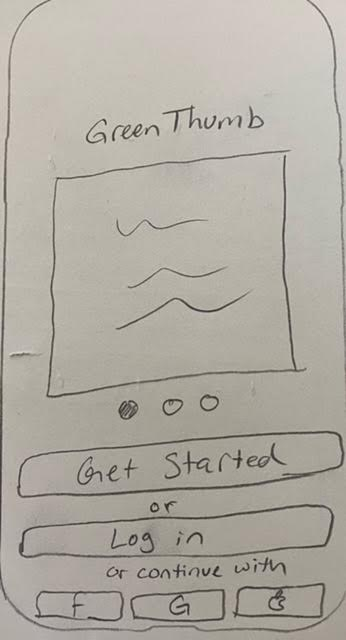
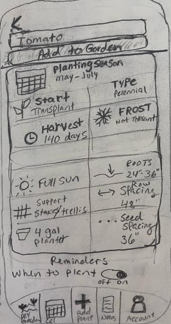
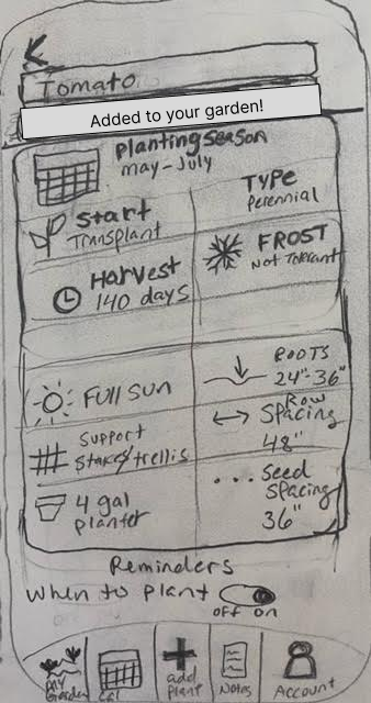
Wireframing & Prototyping
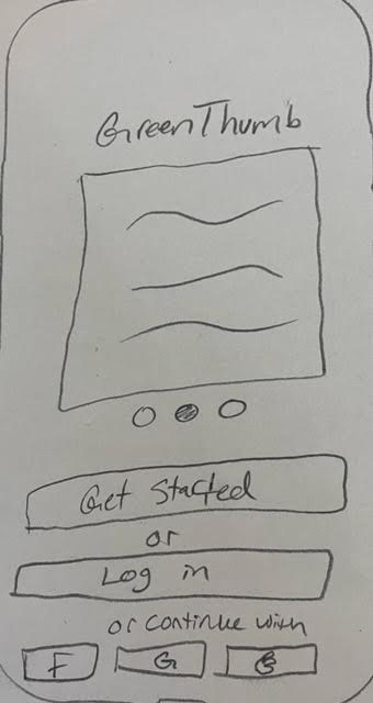
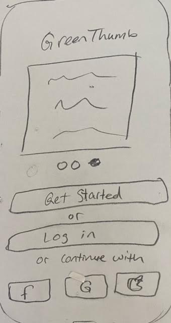
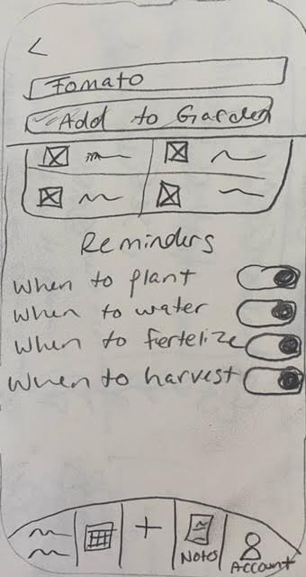
These are the initial wireframes for onboarding and searching to add a plant to your garden.
(Full Figma files can be provided upon request)


User Testing
After the sketches were tested, changes were made to the home search screen, as well as the plant info card screens.
More user tests were conducted on the high fidelity prototype to ensure the iterations were both intuitive and beneficial for the user.
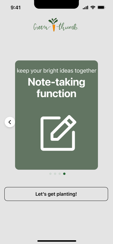
High Fidelity Prototype
(Full Figma files can be provided upon request)
Final Thoughts
Designing GreenThumb taught me how important it is to earn users' trust and instill confidence to encourage them to engage with and rely on your app.
Next Steps
Add photo references to search
Provide recommendations based on USDA plant hardiness zone
Flesh out the calendar and notification functionality